Wednesday, April 6, 2011

Poster FT


This poster depicts the opportunity 'to learn' drifting away from a persons grasp. I gave the hand a dirty kind of look as a lot of people who are denied education are usually denied a lot of other things also including proper washing facilities, a house, food etc.. The sky is bright where the hand may have been holding the balloon and then as it floats off it becomes darker to depict the emotions of the person, having lost the right to learn.


This is the same poster just with a clean hand.


In this version I used the words 'Your Right' as its their right to an education that has been taken away. It may hit home to more viewers as it addresses them and their rights.


Here I made the poster look more simple by making it look like a silhouette image (inverted colours) and by using only three colours. I used orange for the text to make it stand out more.


This is basically the same poster as the ones above but I used the word 'Education' on the balloon. Just to see wat words worked best.


This poster is the same as the black one above but instead I used the word 'Education' in the balloon.


Newspaper Spread

Binge Drinking!


This is a screenshot of my newspaper spread done in InDesign. I don't really know how to use this programme but I seem to be doing ok with it. My text was a bit all over the place at first and the images weren't lining up right with the columns, but I got it sorted in the second attempt. I also fixed the paragraphs and spacing.


This is the finished product. I reduced the size of the font which also looks better and pulled the purple header down a bit from the top of the page.


I printed out my spread and folded it over and took a photo just to show how it would look if it was in an actual paper that had been opened.


This is just a more clear cut final image of my newspaper spread.


Saturday, April 2, 2011

This is my final design (i hope) for my polish vodka label and packaging. I changed the font into a more polish looking one called 'Boston Traffic' and I got rid of my google image and replaced the space with more markings like those I created on the cork of the bottle. In my previous design I tried to work on the 3D view and it was obvious as it just didnt look right. This time I created the design on a flat surface and then used the 'skew' tool in Photoshop to place the image onto the 3D view. I also added the Heraldic sign on the back above the barcode. I changed the text on the cork and box front to vertical text as the letters didn't sit straight when I had them on top of eachother in my previous work.


All over view

Bottle view

Front and side view of vodka box


Back and side view of vodka box

Friday, April 1, 2011

Typography banners

These are banners each team created in class. I am in the Didot team..which won :D each banner had a theme and everyone just added their own touch to them. They are saturated with typography of all types.


Didot


Didot and Helvetica


Baskerville and Futura


Futura


Monday, March 28, 2011

Variation of poster.

For this poster I tried some variations on the font 'Plz Sir'. I used mostly childish looking fonts and also some strong ones that would stand out on a poster. Then I removed the text altogether and added some smaller text on the bottom left corner of the poster. Hopefully the image would be strong enough to attract people over to look at the poster, then they could read the smaller text to know what it is about.


Wednesday, March 23, 2011

Some ideas for PTF

These are just some quick sketches of my poster ideas. I thought the words 'The Right to Education' had to be in the poster, turns out they don't so in my original designs I have not included the title.


PTF

These are the two posters ideas I decided to go with. In this first attempt the colours seemed very 'bland' so i decide to make the image darker.

After making the image darker I realised that the text was a bit harder to see so I decide to turn it into a greyscale image.


This is my final poster, I was happier with the outcome of the greyscale and brought back in the red colour of the word 'FAIL' so it would stand out more.

This is my second poster, I used a shadow of my arm and then took a sketch of a little boy praying, turned it into a brush in photoshop and stamped it onto the image. I mis-spelt the word 'please' intentionally to show how the boy is lacking an education. He is being sent away from school.

I wanted to bring in more typography to this poster so i decide to turn all the images into type. I done this in photoshop, by placing a range of Arial letters over the images. I then added some red through the black type to make it stand out more. I used a more childish font for the 'PLZ SIR' as the child's writing would obviously not be good.


Thursday, February 24, 2011

Typepro 4 - Type as image

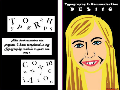
This is the front and back cover of my project book. I'm working on it using InDesign.

This is a portrait of myself that I created using only letters from the font Matisse.

Monday, February 21, 2011

Polish vodka label

When I added the label to this bottle, it became clear pretty quick that it wasn't going to work. It looked too botched and didn't stand out at all. Instead of running towards this bottle to buy it...I'd probably be running away from it! The opacity of the red on the label was way too low and it was impossible to read the writing. I added two purple tone stripes to see if it could make it more modern looking but it didn't work. The clear bottle also seemed boring and typical, so I decided to develop my design even more.
At last I came up with a design that I personally think works. The previous bottle seemed too flat so I used the pen tool in Photoshop to draw around a Smirnoff bottle and create my own shape in illustrator. I turned the bottle black to make the liquid inside seem more magical as you couldn't see it. I minimized the colour red in the overall design and added black scores in the cork to break up the block of colour. I also used the original image colour instead of turning down the opacity and I think it stands out alot more. I used white to make the name stand out and also to make the Polish sign contrast better with the black.

I didnt want the box to give away too much of what the bottle was like inside but it still contains some major traits to match the product. I ran with the same colour theme, and added some red scores to the top of the box just like on the cork of the bottle. I felt it made the packaging seem more modern. Again I used white for the name and sign as it stood out the best against the black. I would like to think if this were a real product that when people spotted the heraldic sign anywhere, they would immediately know it was advertising this vodka brand.


I am happy with the way my Polish vodka has turned out, I think it looks modern with a magical twist. I do believe it would appeal to a young audience and give them the powers they desire! :-)