Thursday, February 24, 2011

Typepro 4 - Type as image

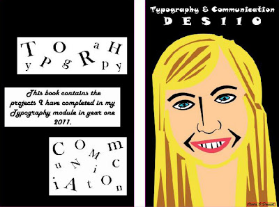
This is the front and back cover of my project book. I'm working on it using InDesign.

This is a portrait of myself that I created using only letters from the font Matisse.

Monday, February 21, 2011

Polish vodka label

When I added the label to this bottle, it became clear pretty quick that it wasn't going to work. It looked too botched and didn't stand out at all. Instead of running towards this bottle to buy it...I'd probably be running away from it! The opacity of the red on the label was way too low and it was impossible to read the writing. I added two purple tone stripes to see if it could make it more modern looking but it didn't work. The clear bottle also seemed boring and typical, so I decided to develop my design even more.
At last I came up with a design that I personally think works. The previous bottle seemed too flat so I used the pen tool in Photoshop to draw around a Smirnoff bottle and create my own shape in illustrator. I turned the bottle black to make the liquid inside seem more magical as you couldn't see it. I minimized the colour red in the overall design and added black scores in the cork to break up the block of colour. I also used the original image colour instead of turning down the opacity and I think it stands out alot more. I used white to make the name stand out and also to make the Polish sign contrast better with the black.

I didnt want the box to give away too much of what the bottle was like inside but it still contains some major traits to match the product. I ran with the same colour theme, and added some red scores to the top of the box just like on the cork of the bottle. I felt it made the packaging seem more modern. Again I used white for the name and sign as it stood out the best against the black. I would like to think if this were a real product that when people spotted the heraldic sign anywhere, they would immediately know it was advertising this vodka brand.


I am happy with the way my Polish vodka has turned out, I think it looks modern with a magical twist. I do believe it would appeal to a young audience and give them the powers they desire! :-)


Typepro 3B: Polish Vodka label designs

I've chosen option B and have designed a new label for a polish vodka. I want it to be aimed towards young people and to come across as a magical liquid. I came up with a few name ideas but in the end chose 'Czysta Magia' which means 'Pure Magic' in Polish.
I started of with a basic label, I used red as the background colour because when I think of vodka I think of the colour red. Perhaps its because I'm a fan of the original Smirnkoff vodka myself. The sign between the type is a Polish Heraldic sign, and I thought it would look cool on a vodka label. This first design seemed too simple so I developed it more.

This was my second design, I kept the red colour quite prominant in the background and added an image of a joker to make it more funky. I used a more gothic looking font for the type this time as I felt the last font was too basic.

Wednesday, February 16, 2011

Tuesday, February 15, 2011

Typepro 2 - B

This alphabet was created using the photos I took of natural letters found in everyday life. I then drew around their shapes in Photoshop using the pen tool and transferred them to illustrator.


Monday, February 14, 2011

Absolut Polish brand


This Absolut vodka is a popular brand. These labels are really colourful and look like graffiti.

The typography is simple block letters and is easy to read.

It seems to be targeted at a young audience and the overall design is really cool. It makes you want to drink the contents.


Vodka Research


Polish Vodkas

The first bottle is obvious that its vodka. It has that frosty looking glass for a start and also the shape of the bottle is quite standard looking.

The second bottle has the typical red label for vodka and has a clear looking glass.

The third one looks like an older type of vodka, the label contains a bison and looks quite authentic.

The last few bottles of vodka are really modern looking, with contrasting colours used in the first two. Black and gold are quite rich looking so its probably an expensive vodka.

The last one has a wacky looking bottle which attracts a younger audience yet the label seems quite sophisticated. Its a simple design but an effective one.


Monday, February 7, 2011